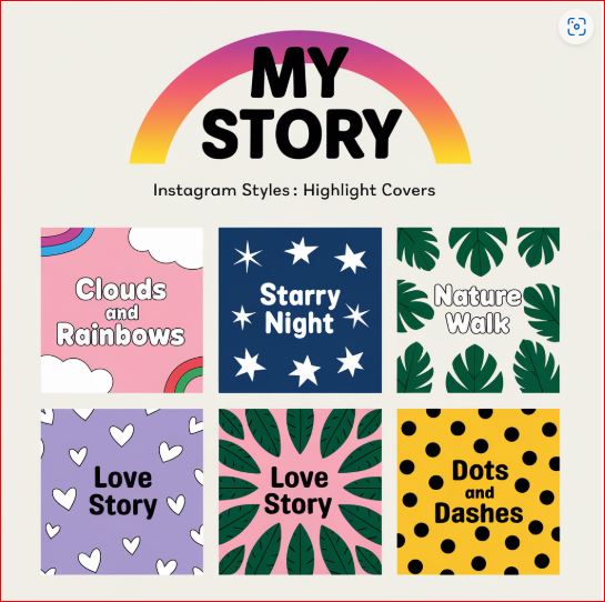
You never get a second chance to make a first impression, which is especially true in the visual-centric world of Instagram. Your brand’s profile is the first stop for all users who want to explore it more. Highlight Covers are one of the many elements that contribute to your overall Instagram aesthetic. These little graphics pack a huge punch sitting up top—just below your bio—and act as visual sign-posts for your best content!
Adjusting Instagram highlight covers by optimizing their color and design can add personality to your brand. It is not just about graphic design but you can use it to devise the brand outlook for first time visitors! Whether you’re a fashion brand showcasing seasonal collections, a café offering a glimpse of behind-the-scenes magic, or an entrepreneur featuring client testimonials, beautifully designed Highlight Covers entice users to tap and inspire them to explore your profile even further.
So, welcome to the art and science of designing Highlight Covers that not only look gorgeous but also fit your brand aesthetic. From what the patterns are for, how to make them cohesive, and how best to make them fit into your overall aesthetics, we’ll take you through it all. Let’s get started!
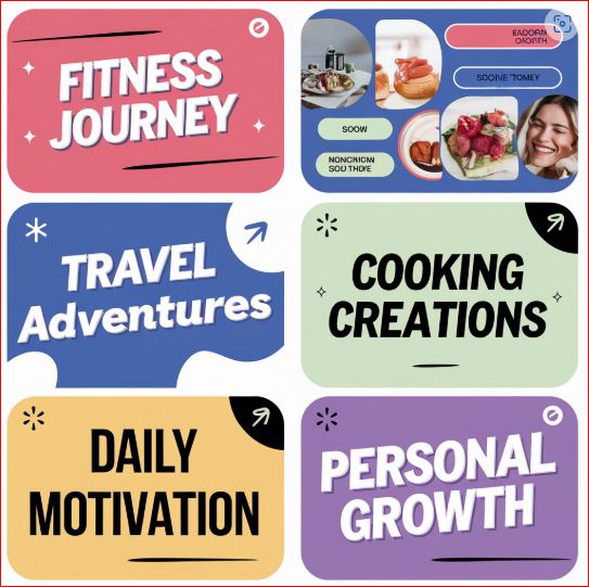
Diving into the Importance of Instagram Highlight Covers
Brand Extension
Instagram Highlight Covers aren’t just pretty icons; they’re a brand extension. These covers can act as a gateway to curated collections of your stories and offer your followers easy access to the content you want to feature. Imagine that as your profile’s storefront—clean, inviting, and meant to grab the attention of passersby!
Profile Aesthetic
Highlight Covers shape your overall profile aesthetic when optimized. They result in cohesion, making sure that every component of your profile seems intentional and in line with your brand’s character. A travel blogger can use colorful, vibrant icons to depict places, but a minimalist skincare company might use straightforward, black and white designs that mirror their philosophy.
Organize Content
Highlight Covers also serve to organize the content for better functionality, in addition to looking pretty. If someone is looking for FAQs, product launches, or event recaps, a well-structured set of highlights ensures they can find them quickly. Combine form with function to create design experience that seems well-oiled, seamless, and easy to engage with for your audience.
How to Choose the Best Topics for Your Highlights
Before you start designing, you need to determine which themes or categories you are going to build highlights around. Your Highlight Covers need to represent your brand or business and include key highlights of what you do and why a follower should stay on your page and follow you!
My advice is to start by listing all the things you often share. Are you a food blogger who shares recipes, restaurant reviews, and cooking tips? Or maybe you’re a fitness coach with workout, client transformation, and nutrition advice highlights. The idea is to choose categories that reflect your content strategy and what your target audience cares about.
Once you start figuring out your themes, you want to make sure they align with your brand values and messaging. A luxury fashion label might have highlights for runway shows, lookbooks, and celebrity endorsements, whereas a small handmade jewelry shop might have categories such as “Behind the Scenes” and “Customer Love.” Customising your themes make sure that your highlights are unique and relevant to your brand’s character.
How to Design Highlight Covers According to Your Brand
Now that you have your themes, you want to bring them to life through design. Your Highlight Covers should be an extension of your brand’s aesthetic and flow with the overall vibe of your profile. Design decisions should be informed by your brand colors, fonts and visual style.
Canva and Adobe Express (formerly Adobe Spark) are tools that easily allow you to create customized covers. Choose a uniform background color or texture that matches your company. On top, add simple text overlays or symbols/icons to illustrate what highlight themes are being discussed. A travel brand, for instance, might select airplane and suitcase icons; beauty influencers could choose lipsticks and brushes!
Your designs should be smaller and less complex. Highlight Covers appear as small icons on mobile screens, so lots of detail may not read well. Create simple striking visual aesthetics that are easy to recognize quickly. By blending aesthetics with clarity, you will create covers that are both appealing to the eye and improve the usability of your profile.
Match the Overall Aesthetics of Your Brand Page
Make sure your highlight covers fit seamlessly with the rest of your Instagram aesthetic as well! Thus, your Highlight Covers must perfectly go along with the overall aesthetic of your brand. For example, consider the style and color palette of your current content. Do your posts consist of pastel colors, heavy contrasts, or earthy tones? Carry these decisions over into your Highlight Cover design to keep everything cohesive.
If your Instagram grid showcases soft muted tones, go for more subtle tones and simplistic icons in your covers. On the other hand, if your profile is full of color, fun, and high-energy, have those covers reflect it with bright patterns or colorful graphics. Cohesion is important—it helps your profile feel conscious and professionally assembled.
You should also think about how the design features in your covers, like how well the fonts, iconography, or textures play together with your other branding elements. Highlight Covers that match the rest of your profile build your brand story and create a great impression on your visitors.
Testing Out Animated Highlight Covers
Static Highlight Covers are a timeless option, whereas animated designs can bring an added flair to your profile. Subtle animations, like a pulsing star or spinning globe, can enhance your covers while maintaining brand integrity. These small gentle motions are eye-catching without being too distracting if implemented properly, encouraging users to tap through to see more of your content.
Animated Highlight Covers might sound complicated, but Adobe After Effects or even simply using Canva’s animation features can help you create them as a beginner. Stick to simple, looped animations that fit with your brand’s personality. For example, a wellness coach with calming, ocean waves, or a tech startup with neon, glowing icons.
Remember, less is more! Designs that are too complex or quick can overwhelm viewers though! With smooth, limited movements, it keeps a clean, professional look. Animated Highlight Covers can go a long way to make your profile stand out from a crowded Instagram landscape, with the right balance of content.
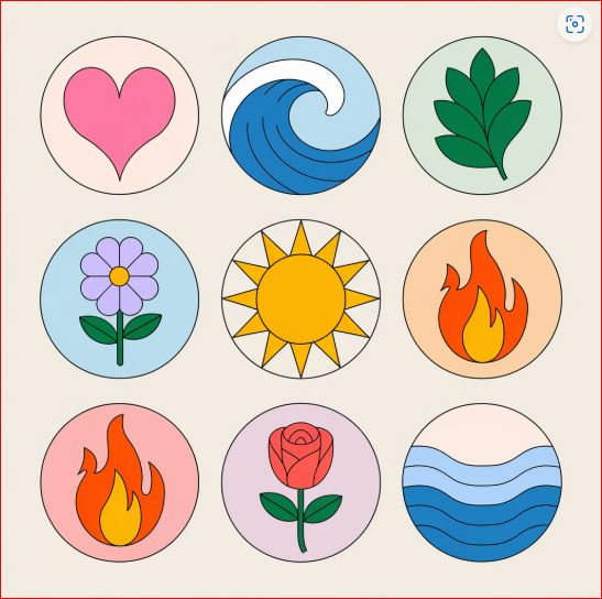
Updating Your Highlights Covers Regularly
Your Instagram profile is a dynamic representation of your brand, and your Highlight Covers should be one element that grows with you as your brand evolves. Whether your content strategy has shifted or a new campaign has piqued the interest of your followers, refreshing your Highlight Covers keeps them relevant and in line with your goals.
Think seasonal updates to align with holidays, special events, or product launches. A florist, for instance, might change their covers to reflect festive themes during their high-season, or a fitness brand could introduce icons for summer workouts as part of a seasonal challenge. Such updates are essential to keep your profile alive and relevant, and it can make the audience come back for more.
Regular updates also demonstrate that your brand is active and detail-oriented. An unprofessional or outdated profile with mismatching Highlight Covers can give potential followers the impression of neglect, whereas new designs demonstrate your willingness to provide a quality experience. Regularly review your highlights to make sure they always showcase your best work.
How to Use Highlight Covers to Tell Your Brand Story
Highlight Covers might not be only design elements but the tools of narration. Each cover is a chapter in your brand’s story that gives followers insight into who you are and what you value. Well-designed covers can evoke emotions, ignite curiosity, and amplify the brand audience bond.
If a brand is focused on sustainability, it can use earthy tones and hand-drawn illustrations altogether to show its environmental focus. For example, a tech company may want to choose sleek, futuristic designs conveying innovation. Whatever your unique brand is, allow it to shine through your Highlight Covers to strengthen user engagement.
By thinking of your Highlight Covers as story elements, you have an opportunity to tell a meaningful story that is more than just pretty visuals for your followers. It’s about more than keeping up appearances; it’s about conveying your beliefs, and enveloping your audience into your journey.
Using User-Generated Content in Highlight Covers
When it comes to Highlight Covers, this is not just about showing off your brand, but also your community. Showcasing user-generated content (UGC) in your highlights is a fantastic way to reward your audience while boosting your brand’s authenticity. Showing off content shared by your followers, such as photos of them using your products or testimonials, makes them feel seen, and also positions your brand as more relatable and personable.
Creating Highlight Covers should stick with this theme. For example, you can use a “Community” cover to aggregate UGC highlights, or you can make covers that have your fans’ favorite hashtags in them. Including one or more of the featured contributors ensures your cover design still fits in with your overall aesthetic, even as it showcases others’ contributions. Displaying UGC this way does enhance the impact of that content, and also makes it a more central part of your profile’s story.
UGC gives followers a sense of ownership, and featuring it in your Highlights can turn casual followers into real fans of your brand. It’s a straightforward but mighty way to make your audience feel like an integral part of your brand story.
How to Create Highlights Covers Without Advanced Skills or Professional Help?
You don't need advanced design skills to create good Highlight Covers. There are a ton of design tools to help you create a professional cover quickly. Websites such as Canva, Adobe Express, and Figma have already created templates specifically dedicated for Instagram Highlights that include customizable icons, fonts, and color schemes.
Pick a tool that you’re comfortable with:
Canva
Canva is ideal for beginners and employs a drag and drop interface.
Figma
Figma will give advanced features useful for more complex designs.
Use these tools to play with different styles until you find one that suits your brand. Most of these platforms further feature tutorials and inspiration galleries to boost your creativity. Feel free to adapt templates to your needs, because a few personal touches make the covers feel like your brand.
How to Avoid Common Highlight Cover Mistakes
Although Highlight Covers could improve your Instagram profile, some mistakes can also weaken their impact.
Overly Detailed Designs
Overly detailed or cluttered designs is a common mistake that cannot be interpreted on small screens. Make sure that your icons or images are clear and simple, and have bold, recognizable shapes.
Design Inconsistency
This is another trap you want to avoid. Viewers may be confused if your covers don’t fit with your whole aesthetic, or seem randomly thrown together. Make sure you spend the time planning a coherent theme that relates your covers to your brand’s visual identity.
Updating Highlight Covers
Finally, failing to update your Highlight Covers can leave followers with the impression that your profile isn’t being actively curated. Keep your designs fresh whenever a new campaign launches or simply to stay in tune with the latest trends.
Not making these three mistakes with your Highlight Covers will ensure they stay impactful and great!
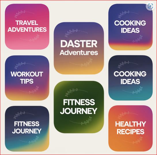
Conclusion – All About Instagram Highlight Covers
Highlight Covers may seem like a small detail in your overall Instagram strategy, but they play an essential role in first impressions and reinforcing your brand identity. From selecting a cohesive aesthetic to playing with animation, every decision about a design contributes to the narrative you’re communicating to the people who might get to see your work. By curating user-generated content, staying current with new designs, and eschewing common pitfalls, you can make these little icons into big branding movers.
Please note, Highlight Covers are not only a visual feast but also a way to connect with your audience and show them the uniqueness about your brand. Put some time into clean, meaningful covers, and visitors will get a much better first impression of your profile. If used the right way, your Instagram Highlights can be a true representation of your brand in terms of creativity, personality, and commitment to your audience!